
Thursday, 29 April 2010


Evaluation
For my evaluation, I am creating a Powerpoint Presentation, I am using the same layout as the original presentation to keep to a business like structure, as the media industry are likely to maintain the same for format for one product. I will rehearse my presentation before presenting it to increase the professional nature of it because I will be more confident because I’ll have a deeper knowledge of what I want to say and how I will say and present my ideas.I have used various questions to help aid my evaluation.
These are the questions I have used:
1) Who do you think the magazine is created for?
2) What kind of music is being promoted?
3) What does the front cover tell you about the content of the magazine?
4) How attractive is the front cover?
5) Is there a wide enough range of items in the contents listing?
6) Is the feature article interesting?
7) Do the images and the text in the feature article fit?
8) How attractive is the magazine as a whole?
9) Would you pick up the magazine and read it if you found it on the train?
10) Would you buy the magazine?
My feedback
I asked the above questions to people within my target age group, I asked my peers in the class and also friends who had never seen my magazine. From the feedback, I can see the likely success for my magazine. All of the five people that I asked for the feedback recognised the genre of music being promoted and the opinion for who the magazine was created was very positive with the target audience being widely recognised as young music fans, dancers and people who enjoy clubbing and party atmospheres.
It is evident from my research that the design of my magazine is appealing to my target audience because all of the people that I asked the feedback questions to, said they would pick the magazine up and read it if they found it on a train. Also, when asking if the target audience would buy the product the overall response was "yes, they would buy the magazine", one of the five people said they woudn't with the justification of not being interested in the particular genre.
All of the interviewees believed there was a wide enough range of items in the content listing and there were no suggestions given for anything which they would expect to find in a music magazine. The article and the photographs used fit their purpose and were interesting to the target audience, thus having met the conventions of a typical music magazine.
Overall, the magazine was very appealing to my target audience and they believed it is an attractive magazine which is bright, colourful and is eye-catching with the graphics in the title standing out. A few of the interviewees said the attractiveness of the magazine as a whole was "good" or "quite good" which suggests a neutral opinion of the magazine as a whole. This is important in making an different decisions if I was to create a similar magazine or do a similar task in the future.
I believe my magazine includes the conventions of a typical music magazine and with these conventions I have attracted my target audience. By asking five people, I have a range of opinions so by having a larger number the results are more likely to be accurate. To improve my feedback I could ask more people the feedback questions; I could use more people within the target age group and people slightly out of the target range because it may appeal to more than just the intended audience. By asking a wider range of people, my magazine is more likely to attract more interest.
Deconstructing my magazine
In the evaluation, I have used a number of bullet points to make my presentation more precise and audience friendly. I have compared it to a music magazine of a similar genre to the magazine I have created. To help achieve my comparison, I have deconstructed my magazine to relate it back to my research and see well I have created my magazine.
Masthead
My masthead is successful and an original design. I have used my research to help me think of the design; in the dance music magazines I have researched the masthead has been bright and bold so I have created a similar feel with a twist. The title of the magazine is quite unusual and is very original, I done research to source any related names and products of which I found none named Shindig Whirl.
Tagline
The tagline was difficult to think of however my research had shown that the taglines were generally related to the music genre. When thinking of the tagline I thought I would include the USP because it is to be a main feature in the magazine. I decided my tagline was going to be: “The best on the block… we will put a groove in your moves” This combined makes a tagline which is similar to the magazines on the market, with an added twist of the mention of the USP.
Images
Research has helped me a lot in choosing the images I was going to shoot, many of the photos used in the researched magazines where photographs taken at live events such as at a gig or concert, many of the images are of music artists and the audiences dancing and enjoying themselves. The images I have taken were very successful and I had a large range to choose from because of the number of photographs I had taken. By having numerous photos to choose from, I have been able to have a wider choice of what I can do with the photographs and amount I can use in my magazine. It was important to take lots of photos because if some of the photographs were not good enough to use in my magazine, my magzine would likely to be unaffected. My camera and photography skills have improved since the preliminary assignment so I have been able to think more about what I wanted photograhed and how the I would get the best effect.
Distribution
I have done some research for my magazine evaluation to see where I would be able to distribute my magazine. To research this I have walked around various shops and looked on the internet, I have found the most likely places to distribute “Shindig Whirl” would be in large newsagents such as “WHSmiths” or large supermarkets such as “Tesco” as they have a large selection of magazines and are likely to sell lots which is more likely to get my magazine recognised. Also, the Chelmsford’s local market has a large magazine stool which is also are likely distributor for my magazine if it was to be published. Also, from my research I have found a nnumber of magazines, have subscriptions so this could be a likely form of distributing my music magazine.
Technologies
In my evaluation presentation I will talk about the technologies I have used to create my magazine and how they have helped the creation of “Shindig Whirl”. I have used two Adobe products: Adobe Photoshop and InDesign, these helped me to edit my photos and create my magazine. I have also used Microsoft Paint to aid my learning with assignment as I have copied the print screens into the program to enable to me quickly and easily as a JPG files which I have then uploaded to my Blogger account. Also, in my presentation I will talk about my preliminary assignment and how the technologies I have used have helped my main assignment.
Assessment Feedback Sheet
I have used the assessment feedback sheet to help me improve my magazine, I have changed the size of the font on my interview in the feature article and moved the texts into columns, this has created more space so I need to create some more text to fit into the empty space to make the best use of it.
On the front page, a suggestion was to make the “FIRST EDITION” section smaller because it takes up a bit too much space. I have moved it slightly upwards in my magazine, to make it a bit smaller however, I feel that it is a good size because I aim to have the magazine marketed as the first edition so I think this is important to the consumer to show that it is new to the market. Also, with the “FIRST EDITION” being large at the top, it will be more visible to the customer, especially if the magazine is in a magazine rack, if the customer is scanning the rack and can see a bright “FIRST EDITION” banner, it is more eye catching therefore they are more likely to pick it up.
A comment on the sheet was the use of the font “Times New Roman” which is the set default, when looking through my magazine, I have discovered that I had used a mixture of two fonts: Georgia and Times New Roman, so I have changed it so all of the font is now Georgia.
Social groups represented
My magazine represents my target audience: young party goers of box sex inbetween the age of 16 and 25, however my USP would expand my target audience to dance instructors and also DJs because of the link to popular DJs who will have regular blogs in my magazine.
No specific race or ethnicity is represented by my magazine, this is because the race or ethnicity doesnt fully determine the genre of music people are interested in, generally, teenagers have a broad spectrum of music interests and dance music could be one of these.
Attracting my target audience
To attract my target audience I have used similar conventions to magazines that I had used for my research. Both magazines; Shindig Whirl and Mixmag attract a young audience with the use of bright bold colours and both have a celebrity on the front cover. Also, similarities between the two magazines are the straplines, tagline and the barcode which are standard conventions of a magazine. Also both magazines have a marketing idea in mind; Shindig Whirl is promoting the first edition whereas Mixmag is promoting the end of year issue.
Creation of my magazine
The creation of my magazine went well and I am happy with the final product. The preliminary assignment has particularly helped with the knowledge of using the software and the SLR cameras. My time management has been improved from the preliminary assignment, this is because I understand the components involved in creating my magazine and the time that each task is likely to take, especially the blog.
The creativity in the main assignment has improved because I have the prior knowledge of Adobe InDesign and Photoshop because of the preliminary assignment. Adobe Photoshop was very useful to me for editing my photos, the main feature I used was layer masks and layers. Overall, the edited photographs were successful and the problems I had encountered were easily ovecome.
The draft versions of the magazine have helped me when creating the final version because I could assess my original ideas for how I can improve and make my magazine better for my target audience.
In the evaluation for the preliminary assignment, I have said I would spend more time on the masthead and logo because the one created for the preliminary assignement was too basic and in the media industry, it wouldn't be suitable for long periods of time. To achieve this, I have thought of potential ideas of how the design could be and then I have chosen the one I think will work best. I then created the logo using Adobe Photoshop and then placed into InDesign, unlike the preliminary assignment masthead which was created using a textbox in InDesign. My aim for the preliminary assignment logo was to stand out from the typical conventions of a magazine so I poistioned the masthead vertically on the right hand side of the page. I had a similar thought for the masthead in the main assignment, so I have used the design rather than the positioning to make it stand out. The original design and the bright, bold colours have helped to achieve the desired effect.
After, ammending my magazine to make the improvements, I have added some more listings to my contents page which has altered the page number of the competitions page, I had a reference to the competitions in my feature article in which I havent changed the page number to match. In future, after making ammendments, I shall double check what is affected by the changes and then I will change them accordingly.
Overall, I believe I have made my magazine to a high, professional standard by using the typical conventions of a typical magazine. I have attracted my target audience well and my research has been benefical to the creation of the magazine.
Thursday, 22 April 2010
Changes made to my magazine
FRONT PAGE
I have changed the text so it is all Georgia. I have also changed the strapline to make them stand out more and also increased the size of Ratpack because on the magazines I used for my research the celebrities often took up a large section of the front page whereas on my magazine, Ratpack was quite small so didn't stand out as much as inteded.
CONTENTS PAGE
On the contents page, I have increased the size of the contents listing and increased the size of the images to use some of the white space. I have also added two more items to my contents listing to take up some more of the white space and give the reader more for their money.
The page numbers on the photographs were inconsitent so I have made sure they are all filled white with a black backround, one of the textboxes had a white line around it so I have changed it to have no fill.
The size of the text for "THE REGULARS" were a different size to the rest of the contents listing so I have changed this accordingly. To make some of the contents stand out I have added a background colour to some of the listings.
FEATURE ARTICLE
The feature article is meant to be a double page spread so for the final version, I have added another page to the document after the contents page so the feature article is now over two pages.
I have changed the page numbers to match the numbers allocated for the feature article in the contents listing.
I have decreased the size of the text in the feature article and changed it into columns as it would be in a published magazine. Changing the text has created more space so I have added other interview questions.
Tuesday, 20 April 2010
Assessment feedback Sheet
I have recieved an assessment feedback sheet which was given to me after I had submitted the original completed version of my magazine. The sheet gives me a "medal - what has been done well" and a "mission - what can be improved". From this I have learnt that to much space is being used because of the size of the text, especially for my feature article, generally magazine font size is 10 or 12pt. Also, in the media industry money is wasted when there is white spaces on the page, these would often be filled up with advertisments so I should check the amount of space being used and edit my magazine accordingly to utilise the empty space; in the contents listing I could add more listings, however I have worked out the correct number of pages and allocated the advertisments inbetween the articles, so to overcome this I could add some of the advertisments to the contents, ones which should entice the reader such as gig or tour dates. In the feature article space could be optismed by making the text smaller and seperating the text into columns, as it would appear in a published magazine. Overall, my magazine presents a good idea with a catchy name.
Monday, 12 April 2010
Creating SHINDIG Whirl - The Feature Article
I have opened the draft of the feature article of my magazine and used the annotated draft to improve the final version.
I have inserted the edited image of the Renegade logo and resized it to fit across the top of the first page. I have also inserted a paragraph of the companys history and used an effect on "THE HISTORY" and the company website RENEGADELIVE.COM.
 I have inserted the star I created and added the up and coming events and added the same effect as the webiste and paragraph title to this.
 I have added images and repositioned where they were going in the draft copy. Originally I had both parts of the leaflet but I deleted the other side of it which was on the right side because the space could have been used for better photographs. I have used the Place tool to add the photographs then uses the tool bar at the top of the software to edit the rotation of the images.
 I have inserted the interview questions into the textbox which was present in the draft.


 Because the text had been made smaller and put into coloumns to match the conventions of a magazine, more space was created. To fill this gap I have added the other interview questions.
I have inserted the edited image of the Renegade logo and resized it to fit across the top of the first page. I have also inserted a paragraph of the companys history and used an effect on "THE HISTORY" and the company website RENEGADELIVE.COM.
I have inserted the star I created and added the up and coming events and added the same effect as the webiste and paragraph title to this. I have added images and repositioned where they were going in the draft copy. Originally I had both parts of the leaflet but I deleted the other side of it which was on the right side because the space could have been used for better photographs. I have used the Place tool to add the photographs then uses the tool bar at the top of the software to edit the rotation of the images. I have inserted the interview questions into the textbox which was present in the draft.
 I have added the fan effect image because the draft version of the magazine was too plain for the final version. This image adds to the visuals of the magazine.
I have now edited the text around the image so the text and image are not overlapping.
The assessment feedback sheet suggested I put the text into columns and reduce the size. I have also added more images to this page to show the DJ who is being interviewed and images from the event to show the atmosphere.
Because the text had been made smaller and put into coloumns to match the conventions of a magazine, more space was created. To fill this gap I have added the other interview questions. Before my magazine is finalised, I need to ensure that the page numbers are correct because on the printscreens above the page numbers do not match the ones on the contents listing for the feature article.
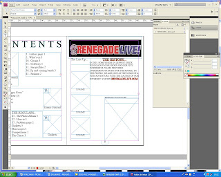
Creating SHINDIG Whirl - The Contents Page
 I have placed the "contents" title into the page, positioned it at the top of the page and have used the toolbar at the top of the page to edit the size of the image.
 I have now added the contents listings using three text boxes which will enable me to position sections of the contents in different places across the page. I have also added the page number in the bottom right-hand corner.
 I have now added a textbox along the bottom of the page to insert the publishing details because from my research I have found this is convention of a typical magazine.
 Next, I have placed my edited photographs into the contents page and have positioned them where I would like them and edited the size accordingly to the space on the page.
Creating SHINDIG Whirl - The Front Page
I have opened the draft version of the magazine and used the annotated hard copy to see areas of improvement.

 I have used the colour selection to add a colour to the background of the text to make it stand out to the customer.
 I have added an effect to "THE LAUNCH" to make it stand out.
 I have added a drop shadow and an outer glow.

Next, I have made a star using Microsoft Publisher then moved it into Miscrosoft Paint to save it as a JPG before transfering it into Adobe Photoshop.


I have opened the star in Adobe Photoshop to delete the backround. To do this I have unlocked the backround and selected the inverse and deleted it.
 I have used the Place tool to add the star and have created a textbox to insert the "FREE CD" text. To avoid taking up space, I have not shown the CD on the front of the magazine, I have inserted a text box beneath the text "*see inside*".
 I have decided to move the "FIRST EDITION" to the top of the page because when doing my research for the areas I would be able to distribute the product, I have seen most of the magazines are sold in racks so if it wasnt shown at the front of the rack you wouldn'd be able to see it is the first edition. Also, if the customer was scanning the racks for a magazine and saw an eyecatching "FIRST EDITION" they are more likely to pick it up than if the "FIRST EDITION" was either ommited or at the bottom of the page as it was in the draft.
 I have filled in the background of the textbox yellow because this is the most eyecatching colour in the main colours I had selected in my presentation. I have also added a textbox which I have coloured blue to insert the RGB selection so it was easy to see when I needed to change the colours of objects in the magazine.
 I have now added the masthead of the magazine using the Place tool. I have edited the size and changed its position to where I think it fits best.

I have now inserted the edited image of the strobe lighting in the background of the front page. I have intentionally oversized it to get the best part of the image in the page and also in the publishing industry, all of the content on the pages will go over the margins to ensure that no white edges are shown when the product is printed and cut. I have also added the RenegadeLive logo to show what the main feature will be.


This is the barcode I created using Microsoft Paint:
 I decided to use Paint to create the barcode because it is easy to draw lines of varying thicknesses on one layer to avoid complication. I copied and pasted segments of the barcode and rotated them to save time.
 After I was satisfied with the look of the bar code I created a textbox underneath and added random numbers. I saved the barcode as a JPG then Placed in Adobe InDesign into my magazine.
 I have used the colour selection to add a colour to the background of the text to make it stand out to the customer.
 I have added an effect to "THE LAUNCH" to make it stand out.
 I have added a drop shadow and an outer glow.
Next, I have made a star using Microsoft Publisher then moved it into Miscrosoft Paint to save it as a JPG before transfering it into Adobe Photoshop.


I have opened the star in Adobe Photoshop to delete the backround. To do this I have unlocked the backround and selected the inverse and deleted it.
 I have used the Place tool to add the star and have created a textbox to insert the "FREE CD" text. To avoid taking up space, I have not shown the CD on the front of the magazine, I have inserted a text box beneath the text "*see inside*".
 I have decided to move the "FIRST EDITION" to the top of the page because when doing my research for the areas I would be able to distribute the product, I have seen most of the magazines are sold in racks so if it wasnt shown at the front of the rack you wouldn'd be able to see it is the first edition. Also, if the customer was scanning the racks for a magazine and saw an eyecatching "FIRST EDITION" they are more likely to pick it up than if the "FIRST EDITION" was either ommited or at the bottom of the page as it was in the draft.
 I have filled in the background of the textbox yellow because this is the most eyecatching colour in the main colours I had selected in my presentation. I have also added a textbox which I have coloured blue to insert the RGB selection so it was easy to see when I needed to change the colours of objects in the magazine.
 I have now added the masthead of the magazine using the Place tool. I have edited the size and changed its position to where I think it fits best.
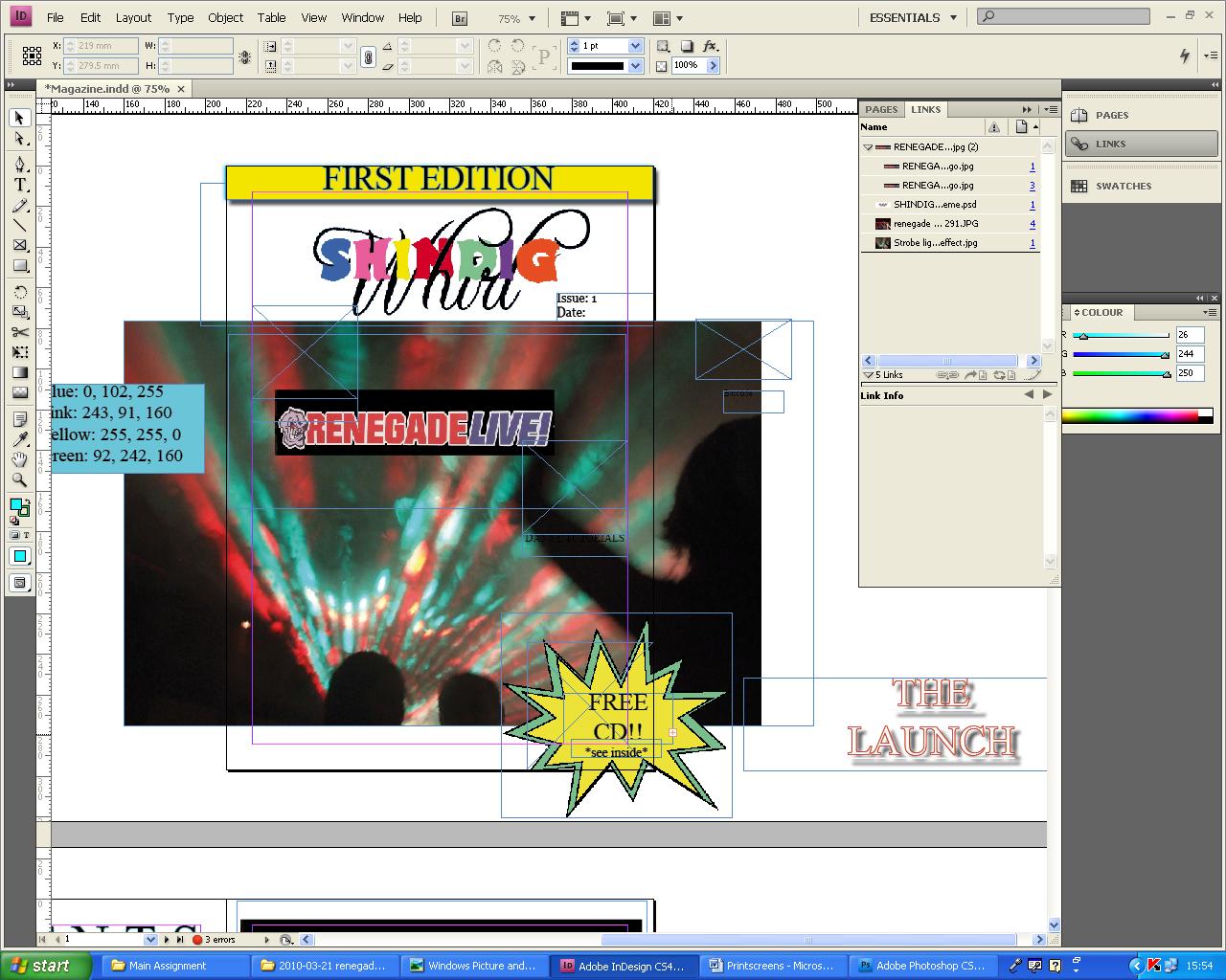
I have now inserted the edited image of the strobe lighting in the background of the front page. I have intentionally oversized it to get the best part of the image in the page and also in the publishing industry, all of the content on the pages will go over the margins to ensure that no white edges are shown when the product is printed and cut. I have also added the RenegadeLive logo to show what the main feature will be.
I have then added a tagline underneath the masthead. I have also added the edited photograph of Ratpack. I also added Ratpacks logo which I cropped from the RenegadeLive poster which I scanned into the magazine.
(
I have now added the dance tutorials image and inserted some straplines which I have coloured white with a black outline which makes the text stand out against the background.
This is the barcode I created using Microsoft Paint:
 I decided to use Paint to create the barcode because it is easy to draw lines of varying thicknesses on one layer to avoid complication. I copied and pasted segments of the barcode and rotated them to save time.
  After I was satisfied with the look of the bar code I created a textbox underneath and added random numbers. I saved the barcode as a JPG then Placed in Adobe InDesign into my magazine.
Editing my photos
I have used Adobe Photoshop to edit the photos I have taken and printscreened them to evidence the process. The main features of Adobe Photoshop I used were layers and layer masks.
Here are the photo's I have edited for my magazine:
The idea to edit the image is to add various photographs taken at Renegade Live and create a college which will be used on the contents page to give the reader a visual insight into the feature article.
 This is the photograph I will use for the background of the collage, I have decided to use this because in the business environment ladies are often used to promote the event ans this photograph it is directly advertising Renegade Live through the females in the photo.
 I have selected various photographs from the collection and added them in seperate layers on Adobe Photoshop. I have intentionally left the background layer locked so I will not be able to make any accidental changes to the main photograph.

Next, I created layer masks on most of the layers and used a selection of the brushes and opacities to delete the backgrounds of the layered photos and create a smooth blurred look surrounding the images.
The idea of this image is to remove the background from the tickets image and insert images from the Renegade Live launch party to create a fan looking effect.

I decided to take this photo to enable me to put the tickets into the magazine, unfortunately because of the grey speckled background, I was unable to use a layer mask to delete the background, so I tried a different approach in which I created a mask and filled it and deleted the colour fill on the tickets. This also proved to be very difficult.
To overcome the issue of not being able to get the tickets on their own, I scanned my copy of the ticket and cropped it to fit the size of the screen.
 This is the scanned ticket.
 Next, I recreated the photograph that I had taken, by opening the ticket in Adobe Photoshop and deleting the white background using the magic wand tool. I then copied the layer and duplicated it twice, I then used the tool bar at the top of the page to rotate each of the tickets to a similar angle of the original photograph.


 The above images were sourced from the internet, originally they were a video demonstrating a dance tutorial. Whilst watching the video, I repeatedly printscreened the video and copied the printscreen into Paint, I had many printscreens of the dance tutorials so I picked the best looking images from the selection. I then opened each printscreen in Adobe Photoshop and cropped the image so the dance instructor was the main subject in the image with a small amount of the background to the sides of the subject to enable a smooth transition into the next image. I repeated this process for three other images.


The purpose of this image is to get the Renegade logo, originally I had printscreened and edited the logo from the website but from an image from an SLR camera, the quality will be much higher.

I opened the image in Adobe Photoshop and cropped it so the background was deleted.

The cropped image now seems too dull in comparison with the radio stations colour scheme, to overcome this I have selected the fill tool with the default colour black and filled teh black background. To enhance the brightness of the rest of the logo, I have selected a similar colour for the red and the blue text and have fillled these also.
 This is the final edited image of the Renegade Live logo.
Here are the photo's I have edited for my magazine:
The idea to edit the image is to add various photographs taken at Renegade Live and create a college which will be used on the contents page to give the reader a visual insight into the feature article.
 This is the photograph I will use for the background of the collage, I have decided to use this because in the business environment ladies are often used to promote the event ans this photograph it is directly advertising Renegade Live through the females in the photo.I have selected various photographs from the collection and added them in seperate layers on Adobe Photoshop. I have intentionally left the background layer locked so I will not be able to make any accidental changes to the main photograph.
Next, I created layer masks on most of the layers and used a selection of the brushes and opacities to delete the backgrounds of the layered photos and create a smooth blurred look surrounding the images.
The idea of this image is to remove the background from the tickets image and insert images from the Renegade Live launch party to create a fan looking effect.
I decided to take this photo to enable me to put the tickets into the magazine, unfortunately because of the grey speckled background, I was unable to use a layer mask to delete the background, so I tried a different approach in which I created a mask and filled it and deleted the colour fill on the tickets. This also proved to be very difficult.
To overcome the issue of not being able to get the tickets on their own, I scanned my copy of the ticket and cropped it to fit the size of the screen.
This is the scanned ticket. Next, I recreated the photograph that I had taken, by opening the ticket in Adobe Photoshop and deleting the white background using the magic wand tool. I then copied the layer and duplicated it twice, I then used the tool bar at the top of the page to rotate each of the tickets to a similar angle of the original photograph.
To complete my idea, I scanned through the index prints of the photographs from Renegade Live and selected a few photos that would be able to be cropped and inserted inbetween the layers of the tickets. Originally, the photos I had selected were too wide for the image, so I decided to find longer, narrower images. I opened the images and dragged them onto the tickets image, they were too small so i used the tool bar to change the image size; upon doing this, the whole of the canvas size decreased and a small segment of the image was now visible. To overcome this problem, I opened the photo as a seperate application and changed the size of the original image before transfering it into the tickets image, I repeated this process for the second image. I adjusted the organisation of the layers to enable the look I have achieved, also when added the new images, I tweaked the angles of rotation slightly to improve the look of the overall image, to ensure that the gaps between the images were more equal.
Overall, I believe the editing of this image was very successful because I was able to overcome the issues that I faced.
The idea of the following image is to create a transition between dance moves. I will use layer masks and the gradient tool to assist the editing.

 The above images were sourced from the internet, originally they were a video demonstrating a dance tutorial. Whilst watching the video, I repeatedly printscreened the video and copied the printscreen into Paint, I had many printscreens of the dance tutorials so I picked the best looking images from the selection. I then opened each printscreen in Adobe Photoshop and cropped the image so the dance instructor was the main subject in the image with a small amount of the background to the sides of the subject to enable a smooth transition into the next image. I repeated this process for three other images.
I then positioned the images next to each other and resized all of the images so they were the same size. Next I moved the two left images closer together and overlapped them, I added a layer mask and used the gradient tool to delete to background, I then done the same process with the rest of the photos to create a smooth transition between the dance moves to make the image seem as if it was in action. The gradient tool was trial and error to what created the best effect on the image.

The above image is the completed image for the dance transition, it was a sucessful editing process for this image however, it could be improved with the level of the bottom of the mirror being level, but this would need more height to the images which was impossible because with the video, there were subtitles as the instructor was dancing.
The above image is the completed image for the dance transition, it was a sucessful editing process for this image however, it could be improved with the level of the bottom of the mirror being level, but this would need more height to the images which was impossible because with the video, there were subtitles as the instructor was dancing.
The idea for the following image was to create a more surreal atomsphere for the stobe lighting. To achieve this I have used the "Filter" tool bar and selected the brush stroke and experiemented with the different options avaliable, I decided the best look for the image was the "Sprayed Strokes"; with the decision made for the effect on the image, I then experimented with the stroke length, radius and the stroke direction.

The purpose of this image is to get the Renegade logo, originally I had printscreened and edited the logo from the website but from an image from an SLR camera, the quality will be much higher.
I opened the image in Adobe Photoshop and cropped it so the background was deleted.

The cropped image now seems too dull in comparison with the radio stations colour scheme, to overcome this I have selected the fill tool with the default colour black and filled teh black background. To enhance the brightness of the rest of the logo, I have selected a similar colour for the red and the blue text and have fillled these also.
This is the final edited image of the Renegade Live logo.
Subscribe to:
Posts (Atom)