I have opened the draft version of the magazine and used the annotated hard copy to see areas of improvement.

 I have used the colour selection to add a colour to the background of the text to make it stand out to the customer.
 I have added an effect to "THE LAUNCH" to make it stand out.
 I have added a drop shadow and an outer glow.

Next, I have made a star using Microsoft Publisher then moved it into Miscrosoft Paint to save it as a JPG before transfering it into Adobe Photoshop.


I have opened the star in Adobe Photoshop to delete the backround. To do this I have unlocked the backround and selected the inverse and deleted it.
 I have used the Place tool to add the star and have created a textbox to insert the "FREE CD" text. To avoid taking up space, I have not shown the CD on the front of the magazine, I have inserted a text box beneath the text "*see inside*".
 I have decided to move the "FIRST EDITION" to the top of the page because when doing my research for the areas I would be able to distribute the product, I have seen most of the magazines are sold in racks so if it wasnt shown at the front of the rack you wouldn'd be able to see it is the first edition. Also, if the customer was scanning the racks for a magazine and saw an eyecatching "FIRST EDITION" they are more likely to pick it up than if the "FIRST EDITION" was either ommited or at the bottom of the page as it was in the draft.
 I have filled in the background of the textbox yellow because this is the most eyecatching colour in the main colours I had selected in my presentation. I have also added a textbox which I have coloured blue to insert the RGB selection so it was easy to see when I needed to change the colours of objects in the magazine.
 I have now added the masthead of the magazine using the Place tool. I have edited the size and changed its position to where I think it fits best.

I have now inserted the edited image of the strobe lighting in the background of the front page. I have intentionally oversized it to get the best part of the image in the page and also in the publishing industry, all of the content on the pages will go over the margins to ensure that no white edges are shown when the product is printed and cut. I have also added the RenegadeLive logo to show what the main feature will be.


This is the barcode I created using Microsoft Paint:
 I decided to use Paint to create the barcode because it is easy to draw lines of varying thicknesses on one layer to avoid complication. I copied and pasted segments of the barcode and rotated them to save time.
 After I was satisfied with the look of the bar code I created a textbox underneath and added random numbers. I saved the barcode as a JPG then Placed in Adobe InDesign into my magazine.
 I have used the colour selection to add a colour to the background of the text to make it stand out to the customer.
 I have added an effect to "THE LAUNCH" to make it stand out.
 I have added a drop shadow and an outer glow.
Next, I have made a star using Microsoft Publisher then moved it into Miscrosoft Paint to save it as a JPG before transfering it into Adobe Photoshop.


I have opened the star in Adobe Photoshop to delete the backround. To do this I have unlocked the backround and selected the inverse and deleted it.
 I have used the Place tool to add the star and have created a textbox to insert the "FREE CD" text. To avoid taking up space, I have not shown the CD on the front of the magazine, I have inserted a text box beneath the text "*see inside*".
 I have decided to move the "FIRST EDITION" to the top of the page because when doing my research for the areas I would be able to distribute the product, I have seen most of the magazines are sold in racks so if it wasnt shown at the front of the rack you wouldn'd be able to see it is the first edition. Also, if the customer was scanning the racks for a magazine and saw an eyecatching "FIRST EDITION" they are more likely to pick it up than if the "FIRST EDITION" was either ommited or at the bottom of the page as it was in the draft.
 I have filled in the background of the textbox yellow because this is the most eyecatching colour in the main colours I had selected in my presentation. I have also added a textbox which I have coloured blue to insert the RGB selection so it was easy to see when I needed to change the colours of objects in the magazine.
 I have now added the masthead of the magazine using the Place tool. I have edited the size and changed its position to where I think it fits best.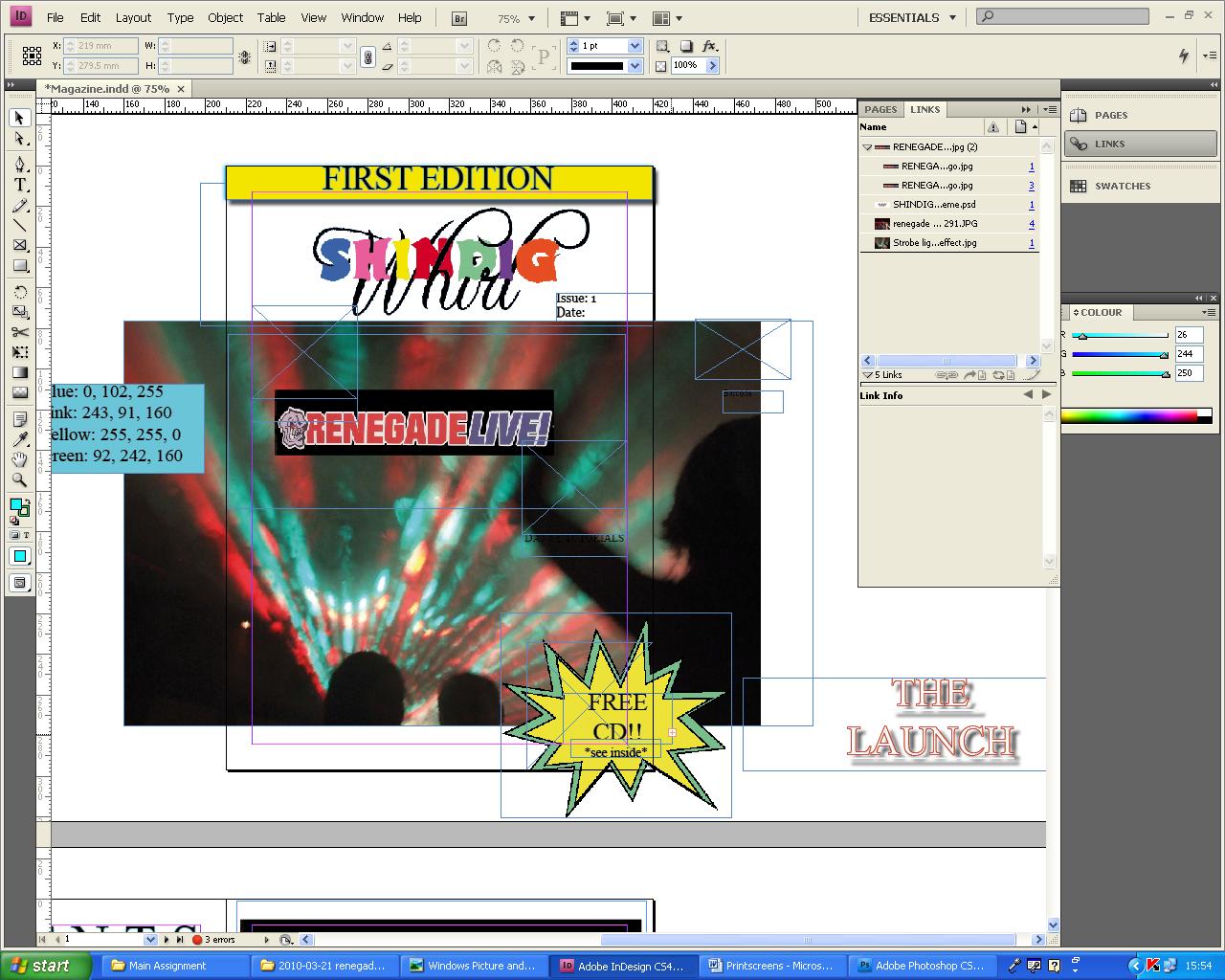
I have now inserted the edited image of the strobe lighting in the background of the front page. I have intentionally oversized it to get the best part of the image in the page and also in the publishing industry, all of the content on the pages will go over the margins to ensure that no white edges are shown when the product is printed and cut. I have also added the RenegadeLive logo to show what the main feature will be.
I have then added a tagline underneath the masthead. I have also added the edited photograph of Ratpack. I also added Ratpacks logo which I cropped from the RenegadeLive poster which I scanned into the magazine.
(
I have now added the dance tutorials image and inserted some straplines which I have coloured white with a black outline which makes the text stand out against the background.
This is the barcode I created using Microsoft Paint:
 I decided to use Paint to create the barcode because it is easy to draw lines of varying thicknesses on one layer to avoid complication. I copied and pasted segments of the barcode and rotated them to save time.
  After I was satisfied with the look of the bar code I created a textbox underneath and added random numbers. I saved the barcode as a JPG then Placed in Adobe InDesign into my magazine.

 I have selected various photographs from the collection and added them in seperate layers on Adobe Photoshop. I have intentionally left the background layer locked so I will not be able to make any accidental changes to the main photograph.

 This is the scanned ticket.


 This is the final edited image of the Renegade Live logo.