Thursday, 25 March 2010

Creating my Masthead

When creating my masthead, I used Adobe Photoshop and Paint to create my ideas, the following images illustrate the process of the creation.
Sourced font website using the search engine Google: http://www.urbanfonts.com/fonts/Candles.htm

I printscreened the page into Paint and selected the size font I wanted and copied that into a new page on Paint and edited.

I then used the eraser tool to delete the flicks of the text.

I have now transfered the edited image into Adobe Photoshop and unlocked the layer to enable me to edit the layer.

Next, I sourced "Whirl" from http://www.urbanfonts.com/ and opened it in Adobe Photoshop and unlocked the layer.

I have used the magic wand to select the white background then used the select inverse tool and delete. I also changed the colour of the text using the fill tool to make it more visible.


With the original image a segment of the "W" was missing so i have used the select tool and selected the curved section of the "l", I then created a new layer and inserted the segment of the "l". I then rotated the segement and moved it to over the gap of the "W", I then zoomed into the curve of the "W" and moved the new layer to a better position on the gap, I then selected the eraser tool and deleted the sections of the curve to improve the fit, next I used a small brush to fill in the missing gaps to make the "W" smoother.

This is the completed "W".

I then moved the "Whirl" image on the "SHINDIG" image and increased the canvas size to fit the image better. I then moved both layers to the centre of the canvas and positioned the "Whirl" layer on top of the "SHINDIG" layer to a position I thought looked the best.

I then created a layer mask on the "Whirl" layer and zoomed into the images. I then selected the layer mask and used the brush tool to delete sections of the writing to give the appearence that the two images are intertwined.

This is the final intertwined version. I decided it would look better with the "Whirl" text being the darker colour to make it stand out more, especially because it is thinner stroke. I then used the fill tool to experiment with the colouring of the text.


In the above image, I have copied the "SHINDIG" layer so I could experiement with the colour schemes, the top "SHINDIG" uses a random colour scheme in which I experimented with the colour swatches to get different colours, however thinking back to the proposal, I had selected various colours which would be my main colour scheme within the magazine so for the bottom "SHINDIG" I used the main colours. There were not enough colours to fill all of the letters so I used contrasting colours, some of which were from the top "SHINDIG" to fill the remaining letters.


I decided on using the second "SHINDIG" because it fit in with the proposal. I then flatterned the image and placed into Adobe InDesign.





The Photoshoot

For my photos, I wanted photos related to the current music industry and set a photoshoot at a live event, The Renegade Live Launch Party at Barhouse, Chelmsford. I took photos using an SLR camera throughout the night of numerous DJs, the attendees and the general atmosphere of the evening, with people singing and dancing to meet the criteria of my proposals.

When planning the photoshoot, I spoke to the co-owner of the radio station to get permission to take photographs and use them for my coursework, conditions from Renegade to the attendees for the launch party, was to allow for photos/videos to be taken and used, a printed list of terms was at the door of the venue and by entering the venue the attendees were agreeing to the terms and conditions of the event. A model form was completed by the co owner allowing all of the photos I had taken to be used.

Also, when planning the photoshoot, I had to complete a location recce and risk assessment form.

Thursday, 18 March 2010

The draft feature article

The following image is a table of possible ideas for the feature article:


I have decided to make my article a live coverage of the Renegade Live Launch Party as I have VIP access and most of the feature articles from existing music magazines have had photogrpahs taken at live venues.


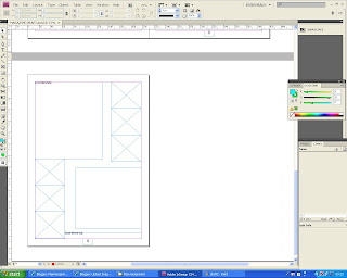
I have opened InDesign and created a four page spread which I have allocated two pages for the feature article. For the draft I haven't spent much time on it to allow mor time in creating the final version of the magazine, to spend less time on teh draft version I have just positioned textboxes and named what will be in them. For the portfolio, I have printed my draft version of the magazine and have annotated it to help with improving the final version.


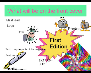
The draft front page

I created a four page spread in InDesign and inserted text and image boxes and annotated them so I knew what would be put in them. I have done this to limit the amount of time I would spend on the draft version so it gives me more time to be able to complete my final version of my magazine to a higher standard.

I have printed a hard copy of the draft copies and annotated them to see how I could improve the final version.

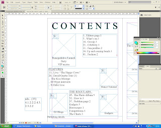
The draft contents page

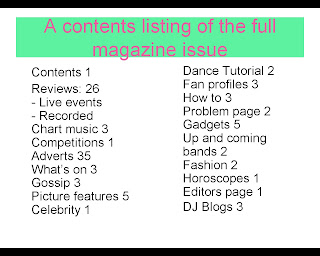
For my contents, I added and positioned various image boxes and annotated what would be in them to give me a rough idea of spacing and how I will lay my contents page out. I have added the contents listing text and roughly calculated the number of pages each article will be and the rough amount of advertisments between each article using the numbers from my prosposal (Pages: 100 Adverts: 35% of the magazine, 35 pages Editorial: 65 pages). I have done it this way to give me more time to create my final version of the magazine.

I have annotated the hard copy of the draft to find ways in which I can improve the final version. Also, I for the final version, I will correctly work out the amount of pages for each article and correctly number them.

Tuesday, 9 March 2010

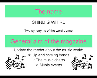
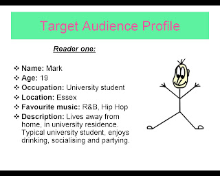
Presentation Slides


Research into specific magazines/potential competition - ABC findings

www.abc.org.uk

I have been on the www.abc.org.uk website to research into potential competitors.

I have looked at several magazines but focused on two main competitors: MixMag and DJMag.
I have found information on the magazines as a whole but generally looked at the publisher, price, frequency of the magazine and the total average net circulation per issue.

From this research, it has given me a better idea on the production of my magazine, I aim to sell it for £4.00 which is a similar price to the competitors magazines. The frequency of the magazine will be monthly, this is the same as the competitors. By publishing the magazine monthly, it gives me more time to take photographs, edit and collate the magazine. The average circulation of my magazine should be around 30,000 in order to keep up with its competition.